................................................
A lot of the time, people will look at a house and say that it is "pretty", "tall", "elegant", or something along those lines. However, they don't know how to explain why these houses are the way they are. There are many elements and details to a house that make it unique compared to its neighbor. Here are some ways to classify roofing styles and housing characteristics.
...............................................
 Shed Roof: Many people know this one as a "lean-to roof". It is a one-slope simple roof.
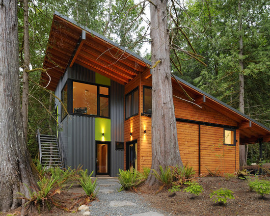
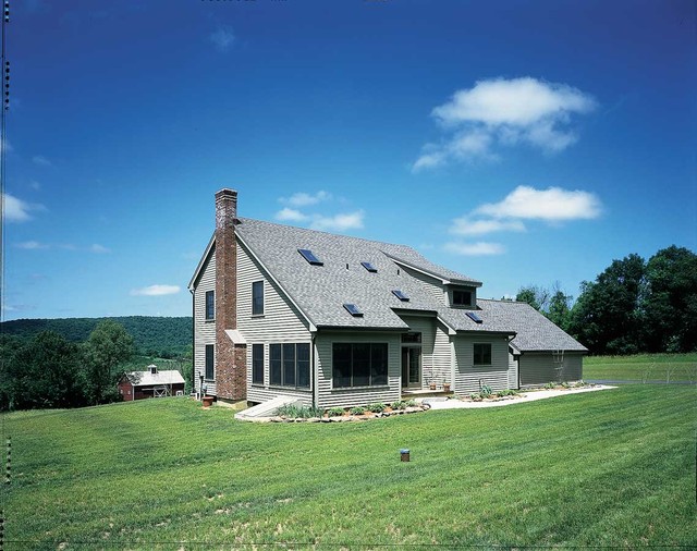
 Gable Roof: This is your typical neighborhood roof that has two slopes coming to a triangular point.
Saltbox Roof: This one is similar to the gable where two slopes come to a point but here, one side is longer than the other.
Gambrel Roof: You would typically see this style on a barn. There are two angles of slope on both sides.
Hipped Roof: All four sides of this roof meet in the middle to form a peak.
Mansard Roof: Similar to the Hipped roof, all four sides meet in the middle but this one has two slopes like the Gambrel.
...............................................
 Bay Window: A set of windows that sit away from the wall of the house providing more light.
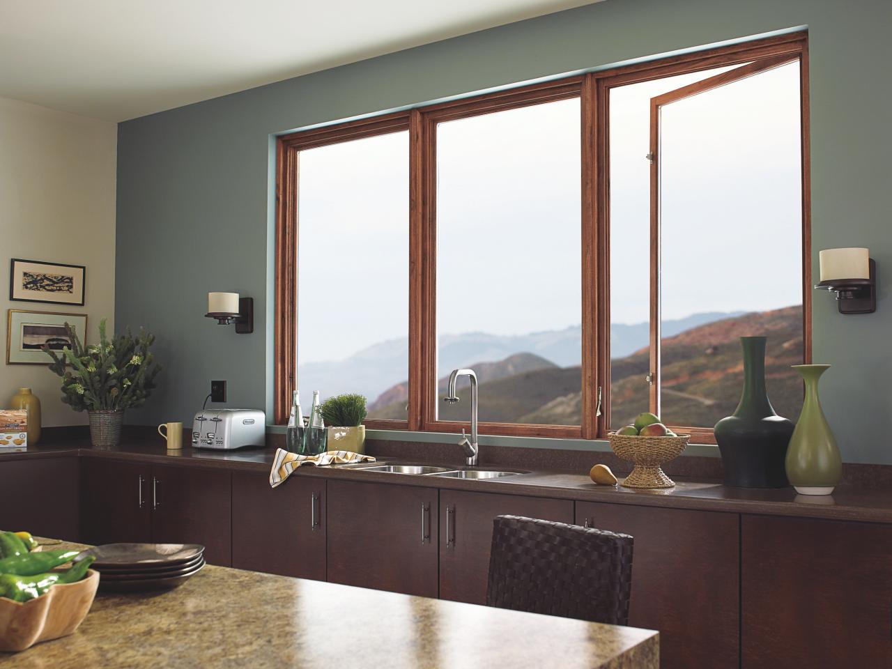
Casement Window: Windows that swing open away from the house.
Clapboard: Overlapped boards to cover the outside of the house.
Dormer: An upstairs window that comes out from the roof.
Eaves: The area of roof that comes out beyond the wall.
Fanlight: A semicircle window above a door.
Palladian Window: A three part window with a larger arched top window in the center and two rectangular windows on the sides.
Pediment: Triangular crowns used over doors or windows.
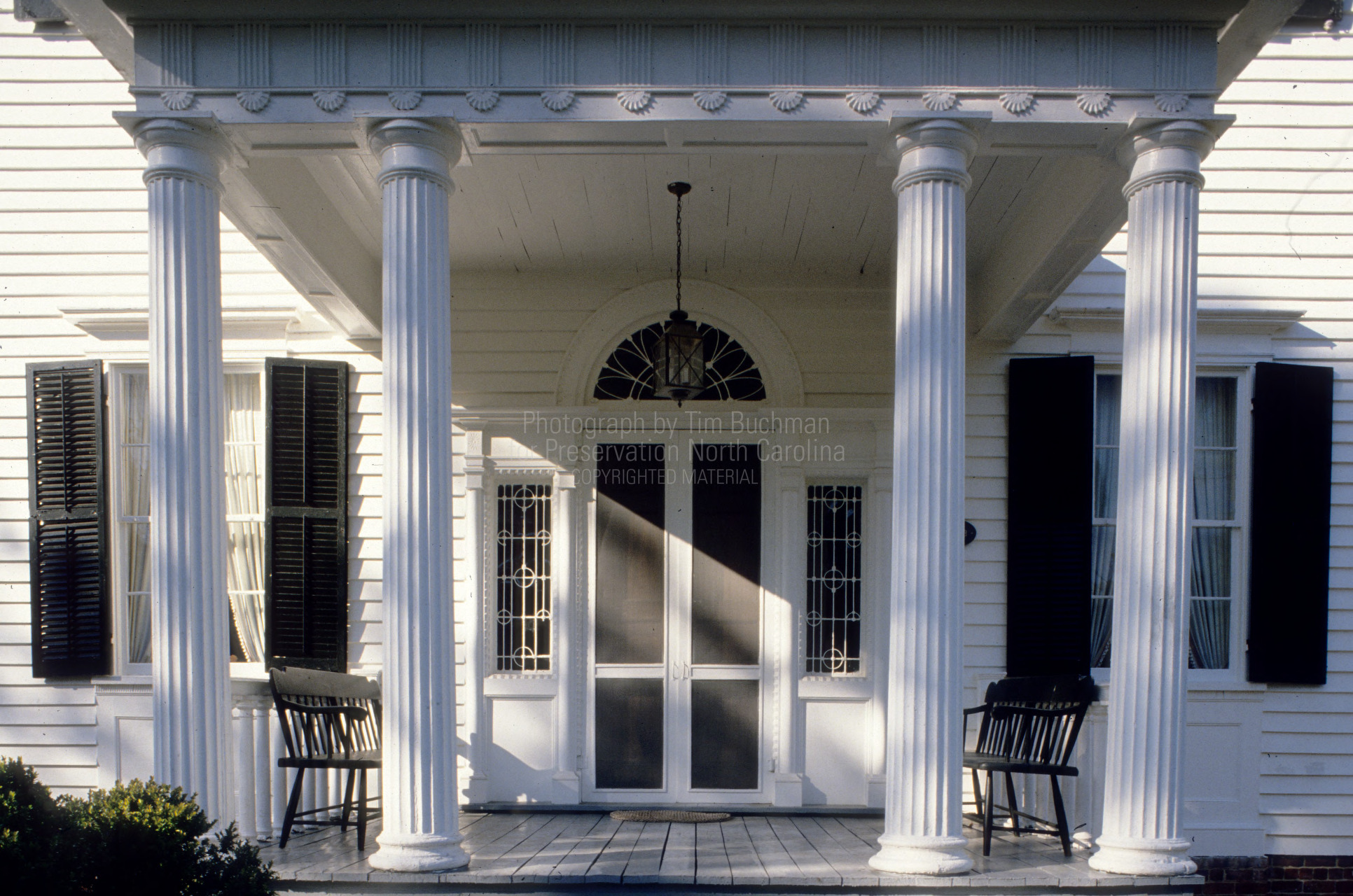 Portico: A large porch usually with columns or pillars.
Rafter: Roof beam that are visible.
Sidelights: Windows on the sides of doors.
Turret: A small tower on the side of a building.
...................................................
I think it is very helpful to know the characteristics of a house and roof because it makes explaining the house much easier. It is also very important for an interior designer to know these things so the outside of the house can reflect what is on the inside and have a nice flow of the whole house.
....................................................


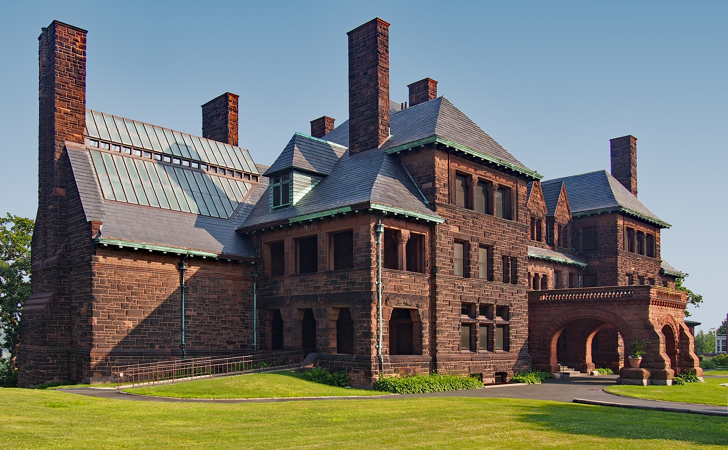
 From 1884-1892 Gilbert designed buildings such as hospitals, depots, and other buildings for the Northern Pacific railway as well as designs for houses, warehouses, retail stores, churches, and office buildings. Many of Gilbert's imaginative designs interpreted details from European buildings and used popular styles from the era. Some styles he incorporated were Romanesque, American Colonial shingle style, Gothic Revival, and Beaux-Arts idiom from Paris. In 1894, Cass Gilbert won the competition to design the Minnesota State Capital. He used Beaux-Arts fusion of High Renaissance Art and Baroque architecture and the dome represented Saint Peters Basilica in Rome.


_W_dormer_eaves.JPG)


