Wednesday, December 23, 2015
Friday, December 18, 2015
Threshold
...........................................
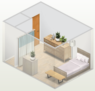
All of the items in this room besides the couch are Threshold brand by Target, designed by Emily Henderson.
All of the items in this room besides the couch are Threshold brand by Target, designed by Emily Henderson.
Wednesday, December 16, 2015
Monday, December 14, 2015
Rhythm
..................................................
REPETITION
Repetition is the repeated process of any kind of shape, object, color, etc. in a room or space. Your eye should be able to continuously flow through the room.
In the first picture, there is a repetition of yellow pillows that draw your eye all around the space. In the second picture, the element being repeated is shape. There are squares throughout this whole room and this is a great example of repetition.
RADIATION
Radiation rhythm in a room happens when there is any kind of sweeping circular motion or pattern. In my first room, there are very bright circles on the floor that are repeated and your eye is immediately drawn to them. In my next example, the headboard of the bed is covered in circular shaped leaves that that have radiation rhythm.

GRADATION
Gradation rhythm is any kind of gradual change being made to the repeated object. This can be size, color, shape, height, etc. In my first example, the bookcase lengths are getting bigger toward the base. Next, in my picture with the dresser, the color of the drawers is gradually fading going up the dresser.
.................................................
Friday, December 11, 2015
Emphasis
.................................................
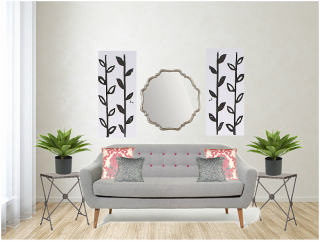
Today's focus in Interior Design was on the Principle of Design-emphasis. For this blog, we each drew a piece of paper with some kind of focal point that we each had to design a room around. My item was a mirror. My design has a lot of different details in it but yet the mirror behind the couch still stands prominently as the focal point.
.................................................
Balance
...........................................................
ASSYMETRICAL
............................................................
SYMMETRICAL
...............................................................
Tuesday, December 8, 2015
The Great Gatsby Inspired
..................................................
When it comes to designing a room for a client, you really have to understand the vision they want for a room. In order to make their vision come to life, you first have to do your research and meet with the client. In Interior Design this past week we had to create a Great Gatsby inspired mood board using http://www.polyvore.com. However, before we rushed into created what we wanted, we had to do our research on The Great Gatsby and the 1920's. The idea behind the room wasn't to create the exact set of the movie, but we wanted to design a room for a client who wanted a Great Gatsby feel to it. After scoping the internet for other blogs to get inspired by and then looking for items to use for the boards, I came up with 2 boards to show you.
................................................

...........................................
I got styling tips for the Great Gatsby from mainly these 2 blogs, http://www.hollestewartdesign.com/add-sparkle-and-glamour-to-your-home-interiors/ and http://www.styleathome.com/decorating-and-design/styling-secrets/get-the-look-great-gatsby-style/a/50734. According to Holle Stewart Design, it is important to have layered soft lighting with crystal, glass, and mirrored surfaces to reflect off of. That is why I placed the crystal chandelier and lamp to bright up the room along with the vase, mirror, and mirrored tray for reflectors. This blog also suggested adding white flowers to a room to allow for the green leaves to give your room a fresh feel. Style At Home gave the tip of having luxerious furniture with a variety of textures so the silky and feathered pillow on the classic cream couch added a great contrast. Art Deco was very popular in the 20's which is why I have 3 art pieces to really bring you back to that time period. Finally, this blog stated that clean lines and geometric shapes was very classy at this time. The room divider, mirror, and staircase stand out to be bold and geometric in my mood board. I wanted a clean and classic color scheme for this board because I wanted most of the focus to go onto the detail of the layered textures and items throughout the room.
.......................................................

..............................................
I really enjoyed the tips the 2 blogs I used in my first board so I stuck to that design aesthetic. In The Great Gatsby, Gatsby references the green light that shines across the bay at Daisy's house and is a symbol of their love. I wanted to incorporate that into this design so I added pops of green with the candle, pillow, and vine. Holle Stewart Design says that having neutral colors with some kind of bold pop of a rich color is very Gatsby. This ties into my green theme with the neutral blacks and grays in the rest of the board. I added shiny crystal and mirrored items for reflections and elegance. The velvet couch has a vintage feel and has a lot of texture along with the pillows. I embraced the geometric designing and added a modern twist with the side table and clock. I wanted to add a light and airy texture to my dark and heavy room so the gray-blue curtain fit perfectly into the design. I through in some more Art Deco to tie the 1920's in that completed the look I was going for.
.................................................
Research before designing for a customer is very important so the client gets exactly want they were visioning and more. When a client says they want some kind of theme, you have to understand the balance between going full on movie set of The Great Gatsby and adding vintage 1920's touches to the space.
....................................................
....................................................
Subscribe to:
Posts (Atom)


